Purple is a color that has long been associated with magic, mystery, and Disney World. If you’ve ever visited the happiest place on Earth, you’ve likely noticed the abundance of purple signs guiding you through the vast property. But have you ever stopped to wonder why Disney chose this particular color for their signs? In this article, we’ll delve deep into the history, significance, and evolution of Disney World’s purple signs.
Disney World’s signs are purple due to a strategic design choice made in the early 1990s by the design firm Sussman/Prejza & Co. Purple was chosen to complement Disney’s classic Mickey Mouse colors and make the signs easy to read. It also helps define when a guest is on Disney World property and enhances the overall Disney experience, as purple is associated with creativity, luxury, and a sense of being in a different world.
The History of Disney World’s Purple Signs
Disney World’s purple signs date back to the early 1990s when the Los Angeles design firm Sussman/Prejza & Co. was commissioned to create a unique wayfinding and traffic sign system for the resort. The firm had previously designed the directional signage for the 1984 Olympics in LA, and their approach to Disney World’s signage was equally thoughtful and innovative.
The purple signs were designed to incorporate Disney’s classic Mickey Mouse colors (red, black, and yellow), with purple serving as the complementary color. The choice of purple was intended to make the signs easy to read and help guests navigate the vast Disney World property. The use of purple also helped define when a guest was actually on Disney World property, as it was a different color than the typical green and white signs found on other roadways.
The Significance of Purple in Disney World
The use of purple in Disney World’s signs is not merely a design choice; it’s a strategic decision that enhances the overall Disney experience for guests. The whimsical purple-and-red signs signal the beginning of a Disney adventure and contribute to the immersive experience that Disney World is known for.
Purple is also associated with creativity and imagination, which aligns perfectly with Disney’s emphasis on sparking guests’ imaginations. Purple is used in various ways throughout the park, from the famous “Purple Wall” in Tomorrowland that’s become a popular spot for social media photos, to the character Figment, a purple dragon featured in the Epcot attraction “Journey Into Imagination with Figment”.
The Science Behind Disney World’s Purple Signs
The use of purple in Disney World’s signage is grounded in color psychology and branding. Purple is known to be associated with creativity, luxury, and a sense of being in a different world. These associations align perfectly with Disney’s mission to create a unique, immersive environment for guests. Furthermore, purple is a calming color that can help guests feel more relaxed and at ease as they navigate the expansive Disney World property.
The Evolution of Disney World’s Purple Signs
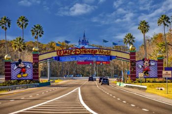
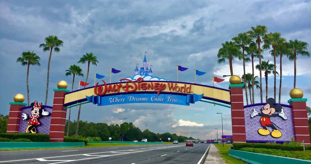
Despite the iconic status of Disney World’s purple signs, they are currently being replaced with a new modern design featuring shades of blue and yellow. This change is part of Disney World’s 50th-anniversary celebration and aligns with the refreshed Disney World gateway sign. While the transition may be bittersweet for long-time Disney fans, it’s an exciting new chapter in Disney World’s rich history.
Purple in Branding and Marketing
Disney World’s use of purple is a brilliant example of how color can be used effectively in branding and marketing. Purple is often associated with luxury, creativity, and a sense of being in a different world, making it an ideal choice for a brand like Disney that aims to create a unique, immersive experience for guests. Other brands can take a cue from Disney and consider how the strategic use of color can enhance their brand identity and customer experience.
In conclusion, the use of purple in Disney World’s signs is a thoughtful and strategic decision that enhances the overall guest experience. Whether you’re a Disney fan, a marketer, or just someone interested in the psychology of color, there’s a lot to learn from Disney World’s iconic purple signs. So the next time you see a purple sign, whether it’s at Disney World or elsewhere, take a moment to appreciate the thought and strategy that went into that color choice.
Frequently Asked Questions
What is the “Purple Wall” in Tomorrowland?
The “Purple Wall” is a blank purple wall located in Tomorrowland at Magic Kingdom Park in Disney World. It has become a popular spot for social media photos due to its vibrant color and minimalistic look.
Who is Figment?
Figment is a small purple dragon who is the mascot of the Epcot theme park in Disney World. He is featured in the park’s “Journey Into Imagination with Figment” attraction.
Why are Disney World’s purple signs being replaced?
Disney World’s purple signs are being replaced as part of the resort’s 50th-anniversary celebration. The new sign design features shades of blue and yellow, aligning with the refreshed Disney World gateway sign.
What are some other ways Disney uses color psychology in their parks?
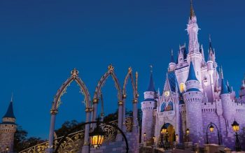
Disney uses color psychology throughout their parks in various ways. For instance, they use forced perspective and color gradation to make Cinderella’s Castle appear taller than it actually is. They also paint things they want to hide, like doors and trash cans, a color called “Go Away Green” to make them less noticeable.
Why is purple associated with luxury?
Historically, purple dye was very expensive and difficult to produce, which made it a color often worn by royalty and the wealthy. This association has carried over into modern times, where purple is often associated with luxury, wealth, and sophistication.

